In 2021, the Ethereum blockchain processed over a million transactions per day, accelerating to over 220 million transactions during the last 6 months of the year.
As developer for a crypto company, maybe you want to build an analytical dashboard to track in real-time the number of transactions processed on Ethereum over, say, the last year. If you try to do this over raw transaction data, you may run into problems depending on the technology you use.
Nobody likes waiting for a dashboard to show results. This is especially true when you’re building for realtime. Fortunately, there’s a pretty quick fix for problems like this: rollups.
The idea of rollups is simple: Queries built over long periods of raw time series data may degrade as the amount of data grows. If you need aggregated time series data over long timespans (e.g. transaction counts over the last 6 months), you shouldn’t calculate the entire aggregation at query time.
Rather, you should use aggregations that incrementally calculate what you want to see. Storing these calculations as new data arrives - and only one time - minimizes the amount of data you scan making subsequent queries much faster and cheaper.
In this blog post, I’ll show you how you might create rolled up counts of Ethereum blockchain transactions using Materialized Views in Tinybird.
What we’re trying to build
In this example, we’re going to query against a large table of Ethereum blockchain transactions from July 2021 to December 2021, containing data for over 226 million timestamped transactions.
We often view time series data in time series charts (duh), and one common behavior for time series charts is zooming in and out. As you zoom in (and shrink the time window), you hope to see more detail. As you zoom out (and expand the time window), you need less detail.
Of course, if you zoom out, you start to ask for more and more data. This can become problematic.
To solve for this, I’ll use rollups to dynamically change the types of aggregations used depending on the time range selected. If I want to view data over a shorter period of time (less than 30 days), I’ll display hourly rollups. If the timespan is 30 - 90 days, I’ll display daily rollups. Greater than 90 days, monthly rollups. All in the name of speed and savings.
This is what I want the end state to look like:
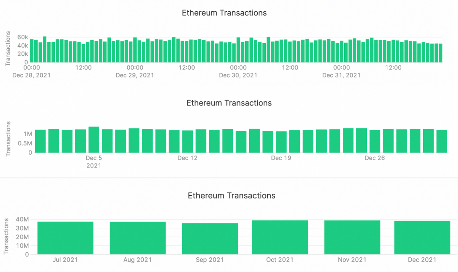
Now I’ll show you how to get there.
Using Materialized Views in Tinybird for rollups
By their nature, rollups are a perfect candidate for using Materialized Views in Tinybird. When you use Materialized Views, you can create new Data Sources containing pre-aggregated time series metrics, and query those again and again. The logic gets implanted in your data pipeline, and aggregations get updated automatically as new data is ingested.
So for this example, I’m going to create Materialized Views for hourly, daily, and monthly transaction counts. As raw transactions arrive in my transactions Data Source, they will be rolled up incrementally by SQL Pipes into three different Materialized Data Sources at each aggregation level.
I’ll start with a Materialized View for the hourly transaction counts.
Similarly, the daily and monthly aggregations are below.
Each of these get’s created as a Pipe node in Tinybird. I can then easily turn them into a Materialized View in the Tinybird UI by clicking on “Create Materialized view from this node”, accepting default parameters, and populating with all of the data. Done.
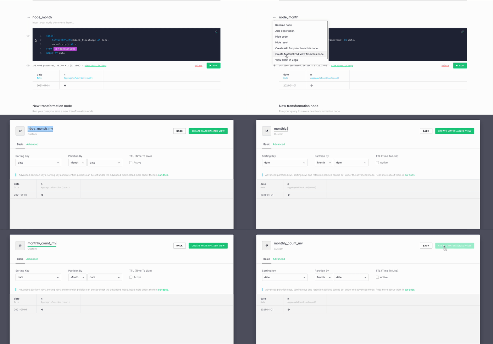
Now, I need to create an API endpoint that will dynamically query the appropriate Data Source based on the time range selected in the chart UI.
Remember, that’s hourly for timespans < 30 days, daily for timespans between 30-90 days, and monthly for timespans greater than 90 days.
Here’s what that looks like, as a new Pipe node:
You can see that I’m defining filter based on start_date and end_date, and choosing which Data Source to used based on the timespan. In each section, I use counteMerge(n) to aggregate all the results (the -Merge combinator ensures that intermediate results in the Materialized View are included in the count), and a then I GROUP BY date.
I can now create my endpoint from that node with a single click.
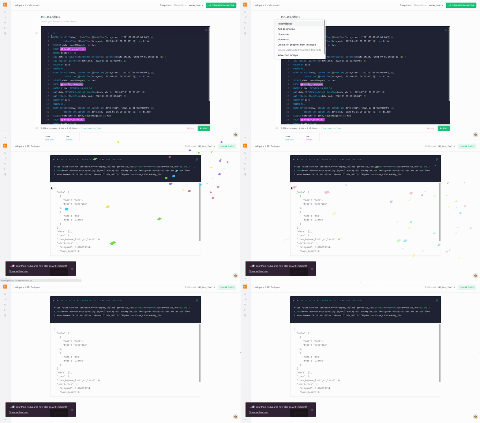
I can now use this endpoint in my application to dynamically change how my chart presents data.
50,000x smaller queries without compromise
The chart example gives a nice visual of how we can use rollups to improve dashboard performance, but I want to dig into the underlying performance by showing how a query that dynamically chooses from materialized rollups performs massively better than one which scans the whole table.
For starters, here’s a quick query I might write to get the count of transactions from September 10th, 2021 at 16:00 to December 14th, 2021 at 10:00
It may be a simple query, but it scans way too many rows and takes too long. The query using Materialized Views, though more complex, is much faster.
The reduction in scan size is massive, from over 226 million rows to just over 4,600!
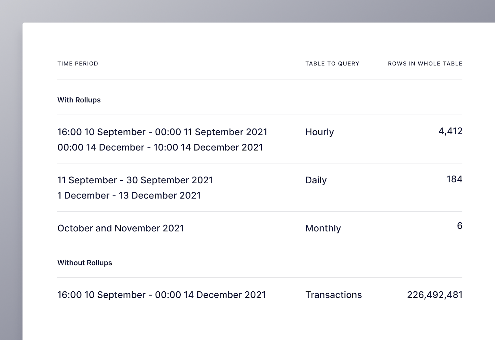
The illustration below shows the structure of my workspace in Tinybird, including how I used both Materialized Views to create rollups for the chart and count endpoints, as well as the raw transactions table to create my baseline endpoint.
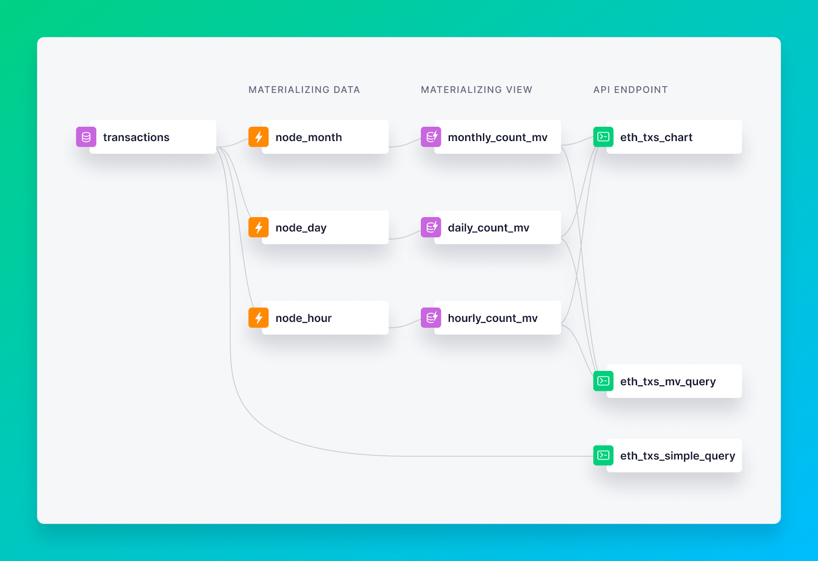
To help visualize how all this works, I’ve created a nice little UI in Retool that you can use to explore how rollups allow us to dynamically update charts, and how much they improve query size and speed.
Finally, I must give credit to Tinybird’s very own Alejandro del Amo, who inspired this blog with an article he wrote about analyzing Ethereum blockchain using Tinybird before he came on board.
If you’d like to try this project for yourself, sign up to a free Tinybird account and simply deploy the GitHub repo here to a workspace to get started.

